Oscar season has arrived!!! Are you excited? We’re excited! Can you tell?
The Oscars is when the Academy of Motion Picture Arts and Sciences comes together and votes on the best films of the past year. They break out the red carpet, dress to the nines, throw a huge awards ceremony, and vote for the best acting performances, best special effects, best screenplay etc… We’ve reached out a few times asking for a new revolutionary category; BEST MOVIE POSTER!
Now, no one from the Academy has responded to our voicemails yet but maybe with your help *wink wink* we can finally get this important category the recognition it deserves. Every movie has one and a lot of work go into them just like the actual movies. A good movie poster can bring in millions more to the box office. And also give a movie a lasting effect even years after the movie debuts. Think back to the Jurassic Park movie poster; iconic, memorable, simple. As soon as you see the outline of the dinosaur, maybe the theme song starts playing in your head or you start looking for velociraptors in your house. That is the power of a great poster!
Until we are able to get this category officially inserted into the Oscar lineup. We’ll give our own prestigious awards for “Best Oscar Movie Poster”. *Disclaimer* If you made the poster of course, you’ll have to come in and pick up the award in person along with the stars of the film to one of our Chilliprinting locations. For the judging, of course, we’ll help outline the criteria for our decisions for the best movie posters.
Some of the requirements for a great poster are: composition, does the poster stand out? Is it memorable? Original? Does it trigger any emotional response from the viewer? If you want to know more about triggering emotions and making your poster stand out. Be sure to check out our posts How To Stand Out With Great Poster Design. And How To Use Color Psychology To Trigger Emotions With Your Poster.
So, let’s get down to the movies and their posters. And…the nominees are….

Immediately what first sticks out is the big UFO like object in the middle. We really don’t know what it is and, paired with the helicopters and the horizon. It makes you think of the future as well as pique your curiosity to what that big UFO thing is. Just that symbol has some potential to make the poster iconic but it also seems outmatched by the faces of the protagonists on the right. It evokes some curiosity, but there’s no real lasting impact and it feels like this type of alien invasion movie poster has been done so many times. See what I mean?

Simplicity can often be the best strategy, but this poster just seems too simple; there’s no subtlety or hidden layers beyond the simple image of our protagonists and an actual fence behind them. There’s no real curiosity here or any foreshadowing of the movie. The simple blacks and greys do a great job of conveying class, power, strength but with little contrast there is no room for intensity and we’re left with a very simplistic feeling (and that might be what they were trying to do in the first place). Looking at this poster, you really have no idea what the movie is about. I see the poster and it doesn’t draw me in or make me want to watch the movie.

There’s nothing in this poster that really stands out from other similar posters. It’s a poster we’ve seen dozens of times using modern western imagery. It won’t be very memorable or iconic because we’ll definitely see a few more like this in the coming years with other movies. Even if this poster falls short in the originality department, one thing it does great is set the viewer up for the plot and intrigue us a bit; a larger than life sheriff watching these two bandits.

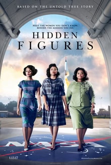
A nice poster but most of us wouldn’t look more than a few times. The movie is very interesting but the poster theme of three protagonists walking toward the camera is overdone, too common, and not memorable. Think about how many posters you’ve seen like this one. The movie is original, about a little known story and true events that helped NASA. We just wish that the poster would reflect the originality of the film and not a screenshot of the slow-mo walking scene from every movie ever made.

Definitely one of the better ones of the year. The heroic medic in the picture is bringing a wounded soldier out from the fog and smoke of war toward safety. The simple red cross in the middle adds to the mystery; is it a cross hair? It because he’s a medic? The only downside is that it feels like this type of imagery has been done in many war movies before. What stands out the most here is the ash that the soldier seems to be rising from as if he has supernaturally risen from death and destruction to save the other soldier. A very powerful concept that leaves us intrigued and wanted to know more. Nice poster and a great war movie.

This is the first poster we see that is really making use of colors. We actually have two images here: the background of Los Angeles, and the foreground of the two protagonists dancing. It seems like the background and foreground connected because the yellow dress compliments the blue sky and seams together the foreground and background. The poster is evoking a bit of nostalgia as well because the shot of the protagonists has a real “Singing in the Rain” quality to it. Even if you don’t know that this is a musical film, the designer of the poster is able to foreshadow that idea across to viewers through the color, font, and nostalgic effects. Great poster.

Brilliant. This could have been the winner this year. If you look closer, the poster is really three images put together to create one face. The left is the younger, the middle older, then on the right is the oldest version of the protagonist in the film. Blue is a great color for transmitting trust, peace, calmness like we have in the left, then in the middle purple that conveys introspection and mystery, and the image spliced on the right a mix of cool soothing blue and dull grey. The three images brought together like this suggest a story of an evolution of the protagonist. We can’t judge memorability too soon, but this poster has potential for inspiration and imitation from fans and critics for similar posters in the future.

Absolutely spectacular! There are three levels to this poster that all work together flawlessly: simplicity, personification, and nostalgia. First, the simplicity of the red in the poster. The red is evoking love, elegance, and intelligence, all qualities of the real Jackie Kennedy. The second layer is the literal personification. The haircut, the pearls, the body language, and the signature in the foreground all scream Jackie Kennedy and the simplicity of the first layer makes the viewer give our complete focus to her.
The final and most powerful layer here is the nostalgic and historical feeling that the poster evokes. Many of us are too young to remember, but television became mainstream when JFK was in office and Jackie Kennedy hosted the first televised tour of the White House wearing this exact outfit. It was a big deal because it was the first time Americans got a glimpse of the human side of White House.
Humanizing the president and his family, popularizing the Kennedy name, and a huge reason for this was the class, elegance, and kindness of Jackie. Wearing this same dress in the poster as she did in the tour. Jackie is inviting us once again to enter into her private life. Our favorite thing about this poster is that even when so many movies are trying so hard to impress audiences and draw them in with special effects or star power, simplicity, and nostalgia can be even more powerful. Bravo.
Did we get it wrong? Did we miss your favorite movie poster of the year? Is there anything noteworthy about any of the posters that we left out? Leave a comment and a link to your favorite poster. And maybe we can do one of these articles for “All-time Greatest Movie Poster Awards”. Also, Natalie, you can swing by anytime to pick up your award at your preferred Chilliprinting office *wink*.
You must be logged in to post a comment.